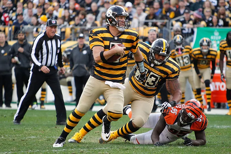
Ugliest Throwback Uniform Award Goes to the Pittsburg Steelers "Bumblebee"
- Epic Sports

- Jul 21, 2023
- 2 min read
Updated: Jul 25, 2023
With all the new 2023 throwback uniforms, we're thankful none are as ugly as the "Bumblebee" throwback the Pittsburgh Steelers wore from 2012-2016. It was a modern (mistake) concept based on the uniforms from 1933-34 when the team began.
The Original 1933-1934 Pittsburg Steeler's Uniform
The 2012-2016 Pittsburg Steeler's Throwback Uniform
While the thoughtfulness was there, the style didn't translate well with current fans. They tried to duplicate the original style, but it was so busy it became obnoxious. It's clear to see why they called it the "Bumblebee." When the team was huddled, it became difficult to see the individual players. Maybe that was the original idea and it helped their defense?
EPIC 100th Season Pittsburg Steeler's Throwback Uniform
If they ever brought back this throwback, they might consider using a subtle heritage style with modern touches. It doesn't have to be an exact design copy of the original.
Thinking about how could they pull off a less atrocious Bumblebee look, I came up with a possible alternate uniform that might be more favored. First, I removed the dingy-looking cream pants and replaced them with classic white pants. They should absolutely nix the completely striped socks, opting for a simpler one-stripe look. The socks and jersey striping combination was far too busy (bee). For the jersey, the stripes are key, but less is more. Much less. Reducing the chest stripes still pays homage to the original design, but also gives more white space to not appear so bee-like.
Giving further thought to the details, four black stripes under the numbers highlight them better, two stripes on the shoulders, and one on each sock. If you count it up, ten stripes = one for each decade they've been playing (ideas for the 100th season 😉). Also, the white blocks around the numbers were awful. It was a bad design choice the first time. It might have been the only option back then because it looks like they could only create the jerseys in a two-color combo. You wouldn't be able to see the dark numbers if they were laid directly on the stripes. Anyway, moving forward with white serif block font numbers with a black drop shadow.
While it's too late for their 90th-season commemoration, it's perfect for the 100th season in 2033. What are your thoughts?


Comments